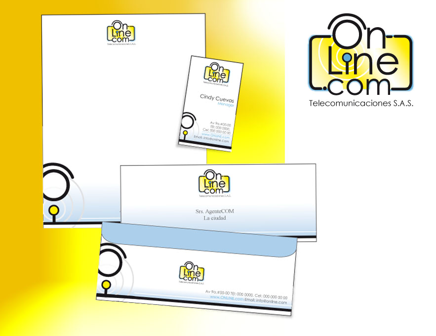
-OnlineCom (Cybercafe)
For this client I designed a logotype, using the same typography to give the impression of a modern button, as all the resources of communications where internet based. Because this company had a phisical store for client attention, I used yellow and blue, creating more eye attention when using exterior signs.
