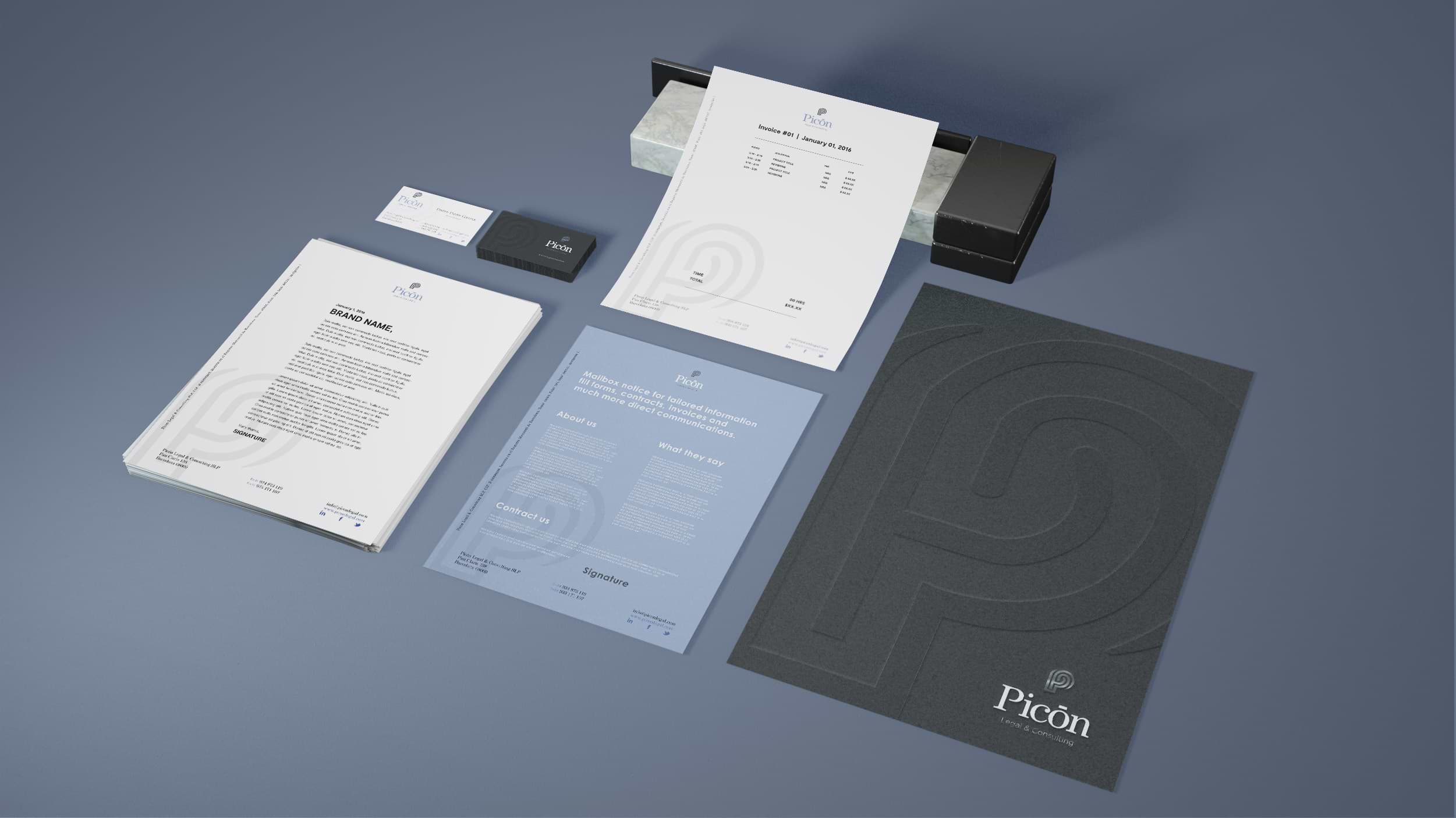
Picon Legal
Because of the research work that this company invest for each client, it was necessary that the logo-symbol resemblance that.
This brand unifies the relation of a maze or a finger print, that communicates the work of it’s lawyers on each case.
The use of gray and a light tone of blue was a though as a great combination to give the impression of a serious brand with a friendly approach.