by SonrisAgency | Sep 24, 2018
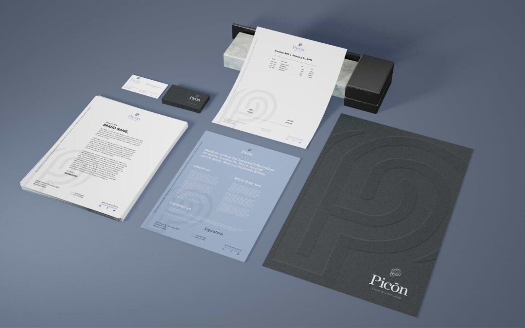
Picon Legal Because of the research work that this company invest for each client, it was necessary that the logo-symbol resemblance that. This brand unifies the relation of a maze or a finger print, that communicates the work of it’s lawyers on each case. The use of...
by SonrisAgency | Sep 24, 2018
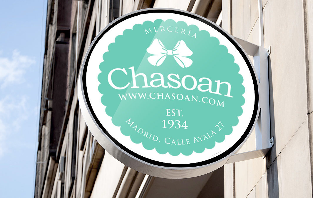
Chasoan (haberdashery) This brand has one of the oldest stores in a very elegant neighborhood in Madrid, their products are usually articles for knitting, embroidery and undergarment. I created a stamp with rounded corners to gently soften their first image...
by SonrisAgency | Sep 24, 2018
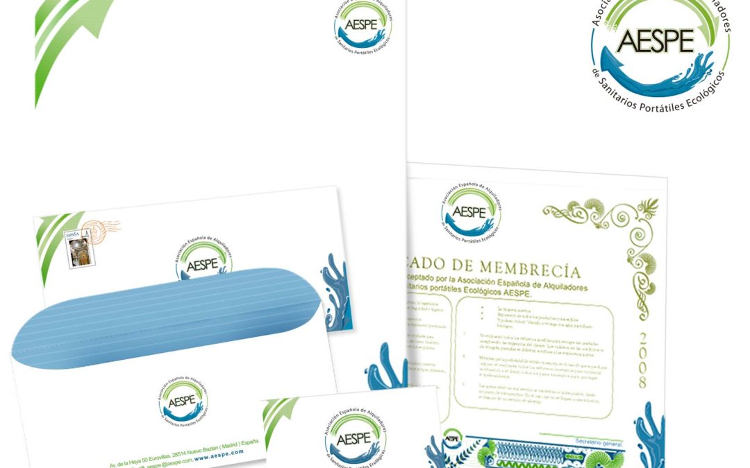
Aespe association This is one of my oldest projects in which I was involved since the start of this association, it might not have a great way of presenting it but I feel like sharing this because it has been a successful corporate identity design. The main benefit...
by SonrisAgency | Sep 24, 2018
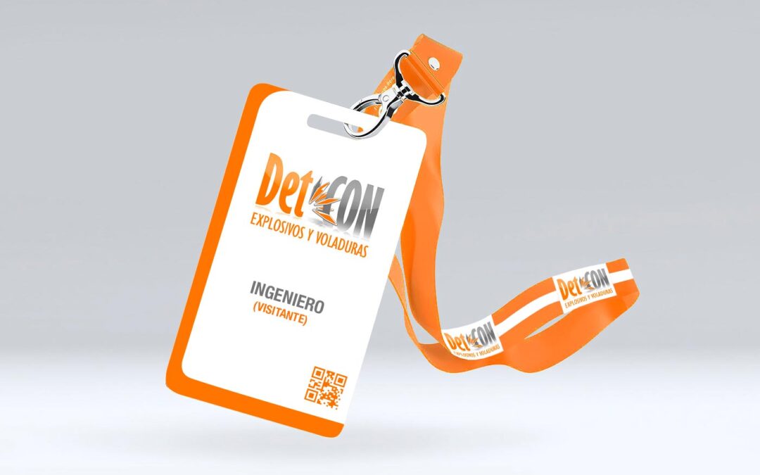
DetCon This company need it to renew their visual identity with a more profesional and accurate look withing the mining engineering field. That’s why I wanted to capture the base of the geology and the specific relation with rock mining. This logosymbol result...
by SonrisAgency | Sep 24, 2018
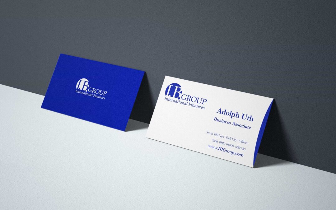
IB Group This company had a global portafolio of finance services, offering from bank transactions to different investments packages. That’s why I develop a rounded form to held the brand, giving a relation of a coin been inserted, but always on sight, the rest of the...
Recent Comments