MRTT Tourism APP
This client need it a brand that could be used as an icon on app stores and in the rest of corporate image material of the offices.
That’s why I’ve designed two of the most strong symbols for traveling and organised them in a way that can easily be understand, when designing a logo for an app we need to think that their are many other icons in the deck of a mobile phone, that’s why I need it to do a research of which colours would be the best to be stand out.
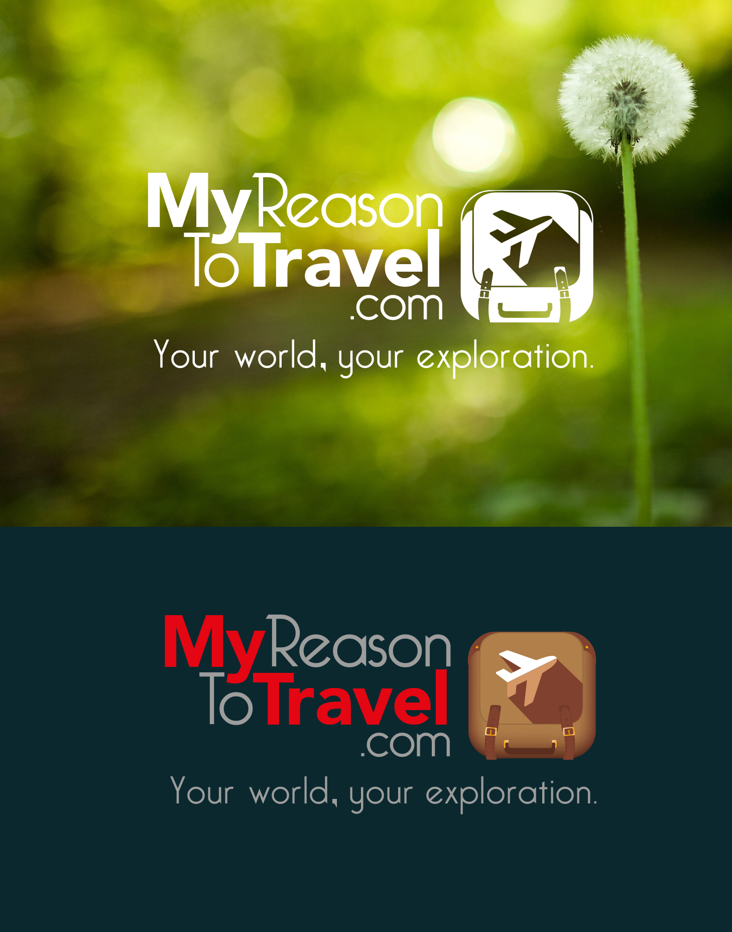
In my brand uses exploration in important to find different situations in which the communication would need to use a logo, like the white version that is commonly used in front of an image.